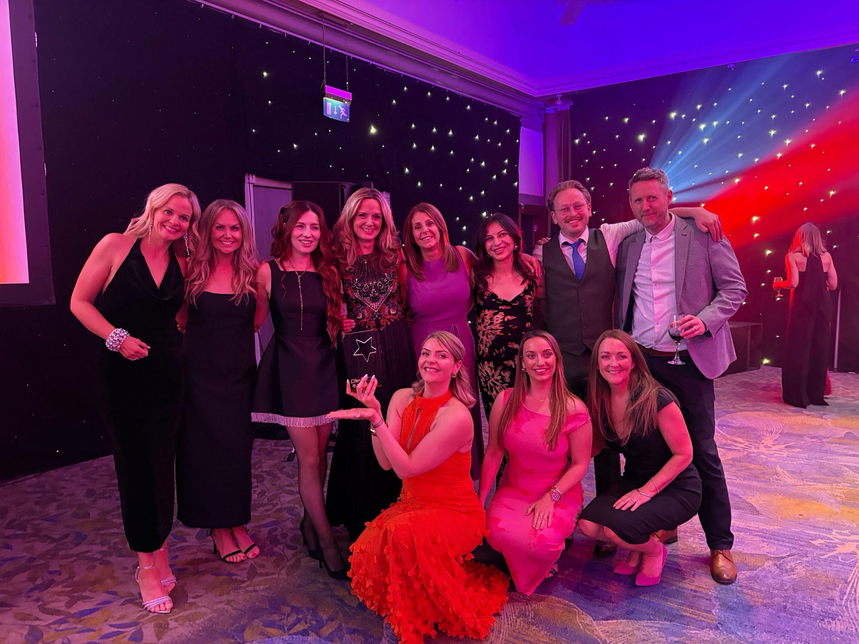
The Union won four Golds, one Silver and one Bronze at the awards event. Here we summarise the winning entries across four of our clients.

Scottish Government | Parent Club
Winner | Gold | Digital Strategy
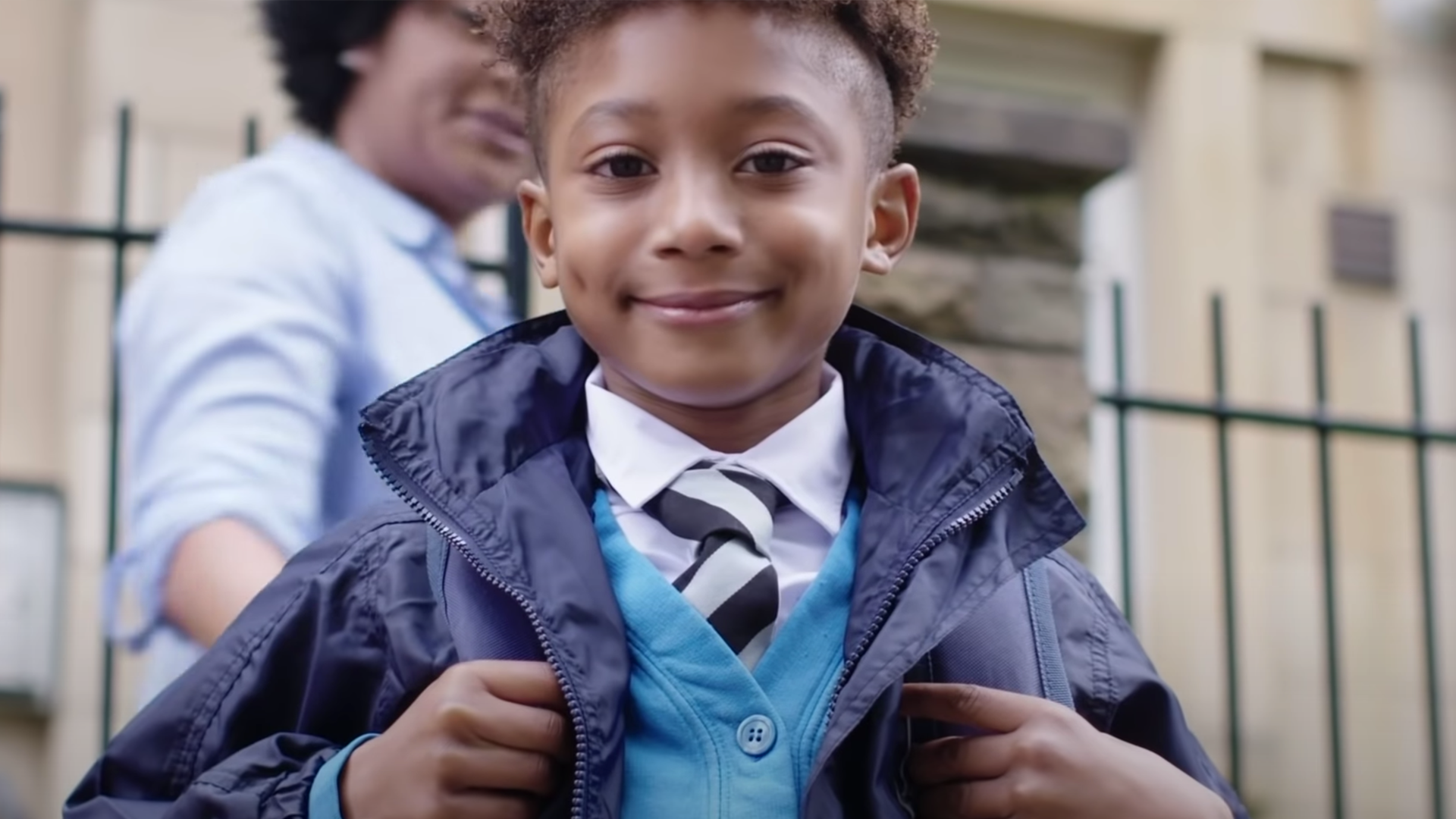
The Scottish Goverment’s Parent Club website is a one-stop hub for parents, providing up-to-date, real world guidance on a variety of children-centric topics to parents and carers. During the chaos of the pandemic, Parent Club’s role became more invaluable than ever. Parents’ worlds were turned on their head overnight, altering their outlook and how they engaged with communications. The Union’s work for Parent Club through the pandemic helped the brand sensitively and skilfully support families in their most desperate time of need. This was down to a sophisticated and detailed digital strategy, combined with engaging, relevant and empathetic creative content. Despite this being an extraordinary challenge in extraordinary times, the results were the best in the history of Parent Club. In comparison to 2019, our work helped increased website users by a massive +310% and the campaigns generated over 2.6 million website sessions. A tangible example of how marketing can benefit society by providing a vital and practical resource to the public.
Scottish Government | Carers
Winner | Gold | Public Sector
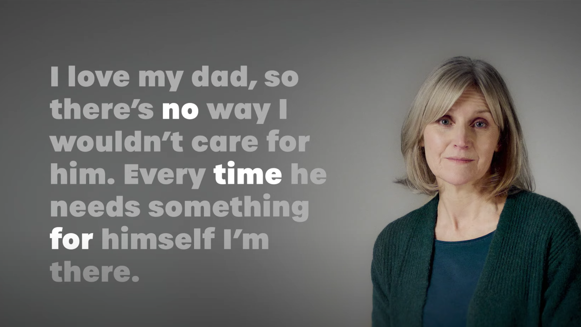
The onset of coronavirus made life unbelievably challenging for over one million people across Scotland who take care of a loved one. Scottish Government and its partners have support resources that can make all the difference. But for these already-busy people,The Union was briefed to show them that it’s worthwhile to make time to support themselves. We did this by pushing our insight to the next level. By unearthing the unspoken truth, we devised a creative solution that triggered a profound emotional response. Paired with careful media and PR planning to reach our busy audience, the campaign confounded expectations. We smashed all targets – including 64% saying they took an action as a result of seeing an ad. An important campaign for a hitherto much ignored and under-appreciated section of society.
Scottish Government | Calling periods, periods
Winner | Gold | Marketing in Society
Periods. Does the very word bring on a hot flush? They’re usually a part of life for people lucky enough to have a womb – though given the inconvenience, mess and fuss that can come with a period, you don’t always feel lucky to have them. In a bid to reduce poverty, indignity and gender inequality, the Scottish Government committed to providing free period products to schools, colleges and universities. Making products available was a huge step forward. But if people are too embarrassed to ask for them, a problem remains. To start to tackle inequality, the Government needed to tackle the social embarrassment. They knew that marketing could make a contribution but when tackling endemic attitudes, built up over decades, where to start?
This was the brief The Union was given. The agency developed a confident and hard-hitting creative approach; bringing the topic and the stigma right out into the open for the first time. Given the limited budget constraints, both agency and client were delighted to not just meet, but to exceed all of the targets. There was 61% campaign recognition; with 53% of campaign recognisers encouraged to take action as a result of seeing the campaign. The campaign also triggered change; with people more willing to think about their attitudes. 30% agreed that they now ‘thought about the way I talk about periods’ and 19% said they felt more comfortable talking about periods or symptoms, with14% changing the language they use to talk about periods. A groundbreaking campaign which achieved tangible positive results.
National Suicide Preventions Leadership Group | United to prevent suicide
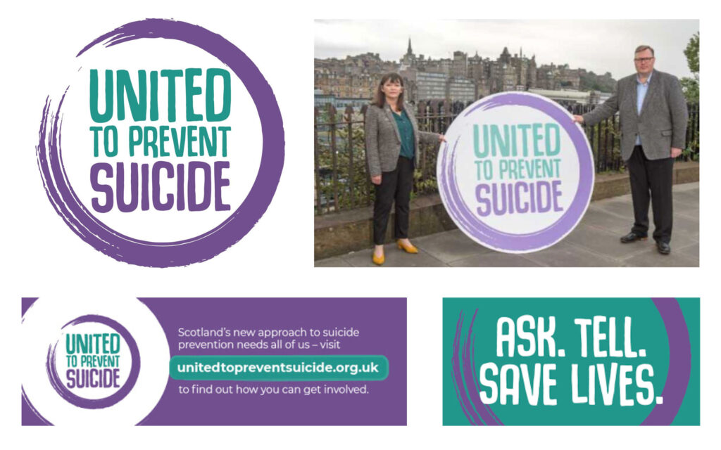
Winner | Gold | Design
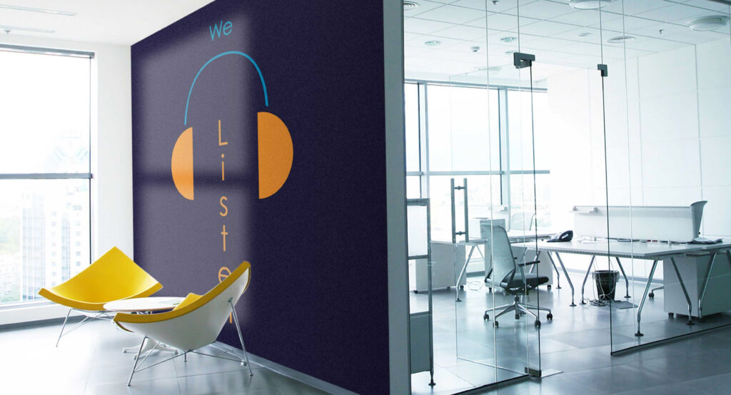
Creating a brand identity for public engagement under Scotland’s game-changing Suicide Prevention Action Plan was an important and complex challenge. How do you give people from all walks of life the confidence to rally behind one of the most taboo, uncomfortable topics that there is? That was the brief The Union was given by the NSPLG. Togetherness and optimism were essential to the spirit of creating a new brand. And so that’s how we approached its development too. Thanks to a highly collaborative process we produced a brand identity with universal appeal and that works hard to galvanise support. An identity that the stakeholders now use with confidence, and which was central to the launch campaign.
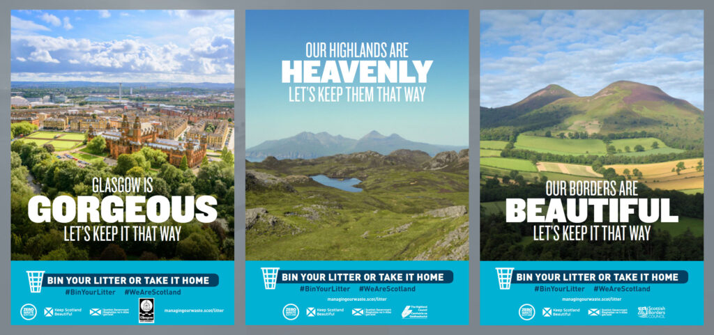
Zero Waste Scotland | Scotland is stunning – Let’s keep it that way
Winner | Silver| Public Sector
Nobody could have predicted how the coronavirus pandemic would impact all facets of our lives – not least how people in Scotland would think and behave when it comes to the environment. When the restrictions were easing at the start of summer 2020, there was a worrying increase in littering. The Union team, working closely with Zero Waste Scotland, turned to behavioural science to understand what was going on, and to find the right solution. With a simple, positive message rooted in personal responsibility for our shared spaces, the ‘Scotland is stunning – Let’s keep it that way’ campaign by The Union re-established positive sentiment towards the public’s impact on the environment; and had triggered a measured reduction in the amount of litter tarnishing our beautiful home.
French Duncan | The people for you
Winner | Bronze | Brand Development
French Duncan, the Scottish accountancy firm, reached out in 2019 to The Union to help them clearly and consistency articulate what makes the firm special; a brand positioning and development brief. We were asked to bring to life that ‘thing’ that everyone that works for, and with, French Duncan feels is there, but which isn’t always easy to put into words. The firm wanted help in telling their story better to clients, prospects, staff and other audiences. The agency was also asked to refresh the visual style rather than reinvent it. Taking the learnings from a range of staff and stakeholder research we created a new brand framework, and then developed a new strapline and creative approach. Centred on the line ‘French Duncan. The people for you.’ the strapline has the ability to adapt depending on the target audience.
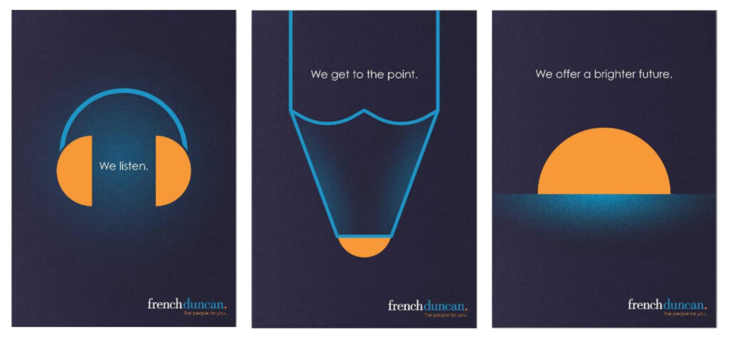
We then deployed a new visual style across all aspects of communications. The results were impressive. Web traffic increased + 70% in 2020 and branded search was up + 200%. Crucially, inbound sales enquiries increased +100%.
